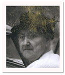
This photo, a cyanotype, has always reminded me of actor Jeff Daniels. There’s a kindness in this fellows face that I see in Daniels.

This is the only cyanotype I have in my collection. It reminds me of long ago when book galleys would arrive from the compositor that were called “blues.” Editorial hated when they arrived because the chemical smell was overwhelming and they were forced to go through each page, line by line, hunting for errors. And the smell did not stay in editorial. It drifted across the divider walls into the art department. Windows would be open no matter what time of year it was.
To explain, when typesetting went from hot metal type to photo-composition things changed. Previously galleys were pulled directly from the hot metal that had been set. When photo-composition came along the galleys, still called galleys though not technically what the original word had meant, were photo processed on light sensitive paper and you ended up with blues. Think of being stuck in a small room with 20 tons of Stainmaster carpet with no venting. It’s been a very long time since I’ve seen blues. Don’t miss them at all!
As to Jeff Daniels? I get my fix every Sunday on the new Aaron Sorkin HBO show The Newsroom. Haven't completely made up my mind yet about the show. The dialogue is clever which can be Sorkin's downfall, but it can also be his strength. I'll give the show time. It's just nice to see Daniels.
X4XM27XU5KKG


Thanks for the lesson on cyanotype photos. I wasn't familiar with them. I do like the blue effect and agree this gentleman with the kind face does resemble Jeff Daniels.
ReplyDeleteGlad to pass it along. Sadly I rarely see cyanotypes The last one I saw wasn't worth the paper it was printed on.
DeleteI love the cyanotypes.
ReplyDeleteThere were so many acrid smells involved in creating print and images!
Oh Robert!!! You're still around. I miss you posting your blog.
Delete